Reykjavík Center Map
Date: 2010 -
Field: Illustration / marketing / sales
Collaborators: Snorri Þór Tryggvason / Baldur Helgi Snorrason / Snorri Eldjárn Snorrason / Brian Suda / Katla Maríudóttir / Yngvi Karl Sigurjónsson / Björgvin Óli Friðgeirsson / Darri Úlfsson
..................................
The Reykjavík center map is an hand-drawn, water colored map of the city center of the capital of Iceland, Reykjavík. The map takes an isometric view to east of the city and was made using a 3D model of the down town area and aerial photographs to ensure accuracy. It is made up of about 140, A-3 water colored drawings.
The map has been praised for its usability, detail and style. It has been printed in 50.000 copies each year since its first publication and is distributed for free. Be sure to look for a free version it while strolling through downtown Reykjavík.
..................................
Gestlalten
GusGus - Higher ft. VÖK
Date: 2020
Field: Motion Design
Title: GusGus - Higher ft. VÖK (Official Music Video)
Artwork by: Elín Edda
Collaborators: Elín Edda, Siggi Kinski & Stefan Arni (ARNI & KINSKI)
Client: GusGus - Higher ft. VÖK
..................................
My first commercial Motion Design Project
In 2020 I was approached for an assignment that turned out to be my first commercial Motion Design Project. The directors, Sigurður Kinski and Stefán Árni (ARNI & KINSKI) needed to animate an illustration by my friend Elín Edda, for the art-collective / electronic music band gusgus. The motion artwork would be featured in their latest music video single, Higher, which features the Icelandic indietronic band Vök. The motion graphics are also set to be displayed in concerts, tours and other marketing material for their up-coming album.
Concept
The illustration is inspired by the tower of Babylon and the Tatlin's Tower. It forms from a winding path that gets elevated by tower segments and then continuously loops as new segments get added to the construction. We wanted to construction of the pillars of the tower to synchronize with the music to some extent. This created a hypnotizing, ever expanding tower animation that loops every 10 seconds. The abstract design and color use form a contrast to the dance sequences and the 3D tower designs featured in the music video. The animation has an appropriate start in the middle of the video, where the music has a short break before winding back up and can be thought in the terms of a diagram, metaphor or as a concept art for the music video.
About GusGus
GusGus is an electronic music band from Reykjavík, Iceland. Although initially a film and acting collective, the group is mostly known for its electronic music. The group's discography consists of ten studio albums. GusGus has had a span of nearly two decades in which they have done nearly every style of electronic influenced music. From techno to trip-hop, from house to progressive house/trance to pop, this collective has made each style their own. The current line up consists of founding members: Biggi Veira and Daníel Ágúst.
..................................
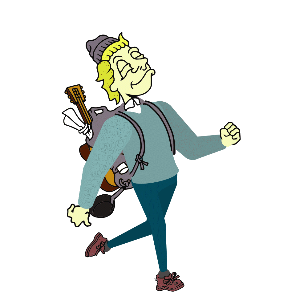
A Walk Cycle / V1.0 (20sec)
Date: 2019
Field: Illustrations / Animation
School: Hyper Island / Karlskrona. Sweden
Program: Motion Designer / 2021 KNA
Course: 02 - The fundamental crafts and tools of motion design / 07 Intro to Character Animation with Morten Niklasson
Instructor: Morten Niklasson
..................................
"A walk is the first thing to learn, ...cause walks are about the toughest thing to do right." Ken Harris
For the course "Intro to Character Animation" with Morten Niklasson we were able to explore and design our own character animations and create a walk cycle. This entailed making a walking puppet and creating a "rig" for them to come to life. The animation was an exercise on the aspects of hand drawn illustrations (line art), combined with vector shapes.
I think a walk cycle is the simplest, complicated animation you can make. We have a deep, primitive understanding of people and their movements and we are programmed to look for social cues and characteristics, however subtle. The same goes for an illustration or when drawing anatomy, the eyes somehow know these shapes of the human body.
The movements of someone's walk can tell a lot about his state of mind, character and mood. The movements are loaded with meaning, every subtitle is important and you can endlessly interpret those movements. In this project I really got the sense of the magic of animation, as cheesy as that sounds. The character comes to life on its own.
The glaring context of passing time in an animation becomes very obvious. You can't look at the character as a set of frames, you have to get the full context of the walk cycle to understand the moment that is being conveyed. Up to that point I hadn't realized how big of a different medium an animation was to an illustration or a painting. You are defining a moment. This moment is also adherent to once perception of people and their body language. Your perceptions or experiences can also change with time and for that reason I feel that a walk cycle is a thing you will never be able to complete, it's always changing. And then there is the physics of it all, which is a thing-in-itself.
"Walking is a process of falling over and catching yourself just in time. We´re going through a series of controlled falls." Richard Williams
..................................
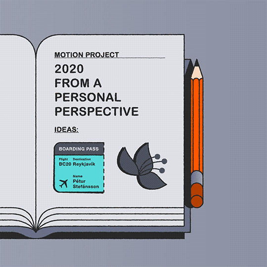
Personal Project 2020 (4:10min)
Date: 2020
Field: Story / Illustrations / Motion Design
Title: Personal Project
Story, Illustrations & Animations:
Pétur Stefánsson
Music: Ármann - “Swift Summer”
Sounds: Recordings & freesound.org
Thanks: Hrefna Lind
…………
School: Hyper Island / Karlskrona, Sweden
Program: Motion Designer / 2021 KNA
Course: 13. Personal project
Supervisors / Instructors: Guðrún Jónsdóttir & Sigrún Hreins
Feedback: Dan Castro, Erik Hellmouth
Industry leaders: Dev Joshi, Dorca Musseb, Emily Suvanvej, Jordan Bergren, Júlía Skagfjörð & Sharon Harris
..................................
The short film "Personal Project" is about the journey that led to the making of the animation itself.
In the last course at the Motion Design Program at Hyper Island, called the "Personal Project", we were tasked with making our own animated short. I wanted to accomplish making my own animation, one where I would explore the story aspect of Motion Design as well as making my own illustrations and animations. I wanted to approach the project as an individual, personal perspective on the historical moment that we experienced in the summer of 2020. This was at the time when I was ideating for my final project, the "Personal Project".
Premise & Intention
WHAT An animated short film (2D, 2,5D), a culmination of my study at Hyper Island.
WHY To showcase my skills in storytelling, illustrations and animation
HOW By delivering a story that reflects my interests and personality
The short film became a sort of summary of my experience of the changing political landscape that we have witnessed in the last couple of years as well as the COVID-19 pandemic. It's about that question "Where were you when.." and the challenge of defining or putting that history in perspective, when you're living it. For me this was a trip from Sweden to Iceland, mid pandemic, in the summer of 2020, where I witnessed an empty, almost dystopian, International airport. For me it summarized the impact of the pandemic and made a big impression. I wanted the film to be reflective, or something that I could look back on in years to come and see where I was at that time, both in my skills in motion design and in my thoughts.As the project grew it became clear that it was also a story about going through challenging times with our loved ones.
THEME Getting through challenging times together
PLOT A couple on a journey experiencing the effects of historical moments
TONE Reflective / Humanistic / Surreal / Dystopian
..................................
Búbblur og Bjór
Date: 2017
Field: branding / logo
Collaborators: Hrefna Lind Einarsdóttir
Client: Guðrún Sigríður Ágústsdóttir / Dagbjört Inga Hafliðadóttir
..................................
Búbblur & Bjór is a champagne/beer wagon which travels to parties and celebrations like weddings, birthdays or corporate gigs to deliver the finest in spirits. The waggon started operation in Iceland in the summer of 2017 and in so doing verified all speculation that the new economic boom of the 2010s has reached its pinnacle.
..................................
the Future Almanac 2086
Date: 2018
Field: branding / Poster
Collaborator: Hrefna Lind Einarsdóttir
..................................
Time Capsule is an almanac from the future for the year 2086. The almanac lists the most historical events of the 21.century, up to the year 2086. On the side of the almanac there is an index of years for which the year calendar also applies to, including the year 2019.
The almanac is meant to give a hopeful, brighter vision for the future. These fictional historical events are based on the most optimistic predictions of the future in technology, science and society.
The almanac visualizes these imaginated events with an amusing, comprehensive illustration that observers can explore and enjoy the whole year round. All the twelve months represented in the illustration (3x4 grid), beginning with January (top left corner) to December (bottom right corner). Among objects in the illustration that note future historical events there are also objects that relate to dates celebrated today like Gay Pride, World Wildlife Day (UN) and christmas.
For later generations the almanac will become an interesting retrospection of the hopes and dreams of the people of the past (2019), and their vision of what the future might behold.
..................................
https://www.instagram.com/thefuture.almanac/
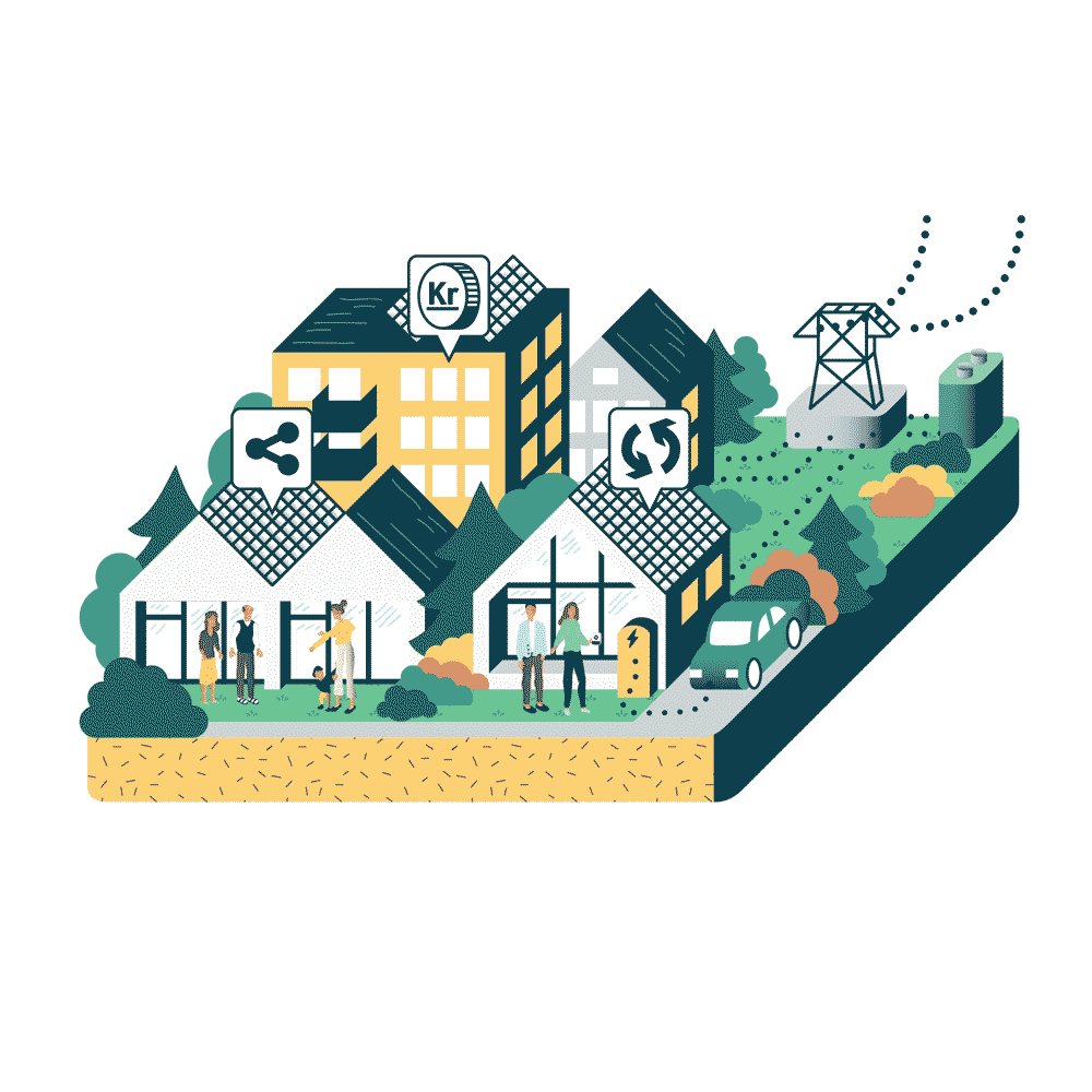
Supergrid (40sec)
Date: 2020
Field: Illustrations / Motion Design
School: Hyper Island / Karlskrona. Sweden
Program: Motion Designer / 2021 KNA
Course: 06 - Concept, brand, treatment and production
Instructors: Rickard Bengtsson, Kamran Ghodsi, Fredrik Lundqvist, Kajsa Råsten & Mikael Hall
Client: Supergrid / Fredrik Billing & Tore Atle Stenbock
Collaborators: Lisa Lennartsson, Miriam Muelle, Henrik Lidén & Ruxandra Nedelcu
..................................
Our task for the course "Concept, brand, treatment and production" was to create a short, one minute animation that would entirely be up to the animation team and the clients to decide and develop. We had some great lectures about the working relationship with both team members and clients.
About Supergrid
Supergrid enables the future of sustainable communities by making green energy accessible for everyone. Neighbourhood can become an independent energy producer by installing PV panels, local energy storage, EV charging and smart meters. The locally produced energy is distributed through a "microgrid" system. Supergrid allows citizens to produce, consume, share and sell energy, and thus be part of the green energy transition.
We were all pleased and excited to work with such an interesting, visionary company. The client showed great trust, support and engagement, regarding both our process and our skills as storytellers and animators. It was especially rewarding working with a client and a product that has such a beneficial and positive impact on the world. It was also exciting to work on a project that addresses big, global issues and that offers a viable, future solution, which will most certainly become the new way in which we gather energy in the future.
..................................
How to Become Icelandic in 60 Minutes
Date: 2012
Field: Illustrations / screenplay / Infographics
Collaborators: Jorri Kristjánsson / Bjarni Haukur Þórsson / Hermann Karlsson / Örn Árnason / Sigurður Sigurjónsson
Client: Thorsson Productions
..................................
A one-man comedy show performed by entertainer, writer and producer Bjarni Haukur Thorsson. As the title suggests spectators are introduced to a blend of incisive and visual observation of the Icelandic human condition as well as a lessons in everything you need to know about being Icelandic.
The act includes a short video introduction to the history of Icelandic society in which characters and events are illustrated.
Video by Hermann Karlsson
..................................
howtobecomeicelandic.is
RÚV Núll / RÚV Krakkar
Date: 2018
Field: branding / logo
Collaborators: Jón Þorgeir Kristjánsson
Client: Ríkisútvarpið (RÚV) / Iceland's national public-service broadcasting organization
..................................
Ríkisútvarpið (RÚV) is Iceland's national public-service broadcasting organization. RÚV‘s history spans over 80 years with regular radio service starting in 1930.
Operating from studios in the country's capital, Reykjavík, as well as regional centres around the country, the service broadcasts an assortment of general programming to a wide national audience via three main radio channels, Rás 1 and Rás 2, available terrestrially, Rondó and one full-time television channel.
In 2018 the service opened tvo new channels, Rúv Núll and Krakka Rúv. These tvo channels are amed for younger viewers such as kids and tennagers. The channels needed unofficial emblems to be used for multiple purposes.
The two images created for the new channels use notable icons and imagery to address the subjects, issues and cultural phenomenons taken on in the broadcasts. The outcome was to do a mix or a collage of these elements where they fused together to create an interesting photomontage.
Additional images where used for and at the quadrennial promotional presentational introduction of the national public-service broadcasting organization (RÚV) in 2018.
..................................
Grandi Mathöll - Þjóðarskútan
Date: 2018 - 2019
Field: illustrations / Installation
Collaborators: Hrefna Lind Einarsdóttir
Client: Íslenski sjávarklasinn / Grandi – Mathöll
..................................
Grandi Mathöll is a pioneering street food hall in Reykjavik, there is only one of its kind in Iceland. The food hall is located in a refurbished fish factory in the Grandi Harbor District downtown Reykjavik. Guests can enjoy watching Icelandic fishing vessels landing fresh fish; some which may actually end on their dish. Grandi Mathöll features 9 artisanal food stands offering Icelandic fish and meat, Vietnamese and Korean street food, fresh Icelandic vegetables, freshly brewed coffee, beer and other drinks.
One of the food halls objectives is the bolster, promote and display local artist and the city´s culture. The harbour has been the life blood of Reykjavík from the beginning and the owners wanted to create an artpiece which would hint to these ideas of culture and the city´s historical history.
ÞJÓÐARSKÚTAN
The wall installation which is located by the entrance to the food hall at Grandi is an historical timeline of events and cultural happenings in Iceland from its settlement. The piece uses the concept or the metaphor of a nation sailing to the future. This is the spirit of the Icelandic mentality, our way of life and is characteristic in the way we think and talk.
Major events are noted in objects which begin with the settlement of the Norwegian-Norse chieftain Ingólfur Arnarson (874) located at the stern to the Icelandic financial crisis (2008) located in the middle and onwards the future located at the bow. The work is intended to lure pedestrians to the location and to some extent be educational or informative.
..................................
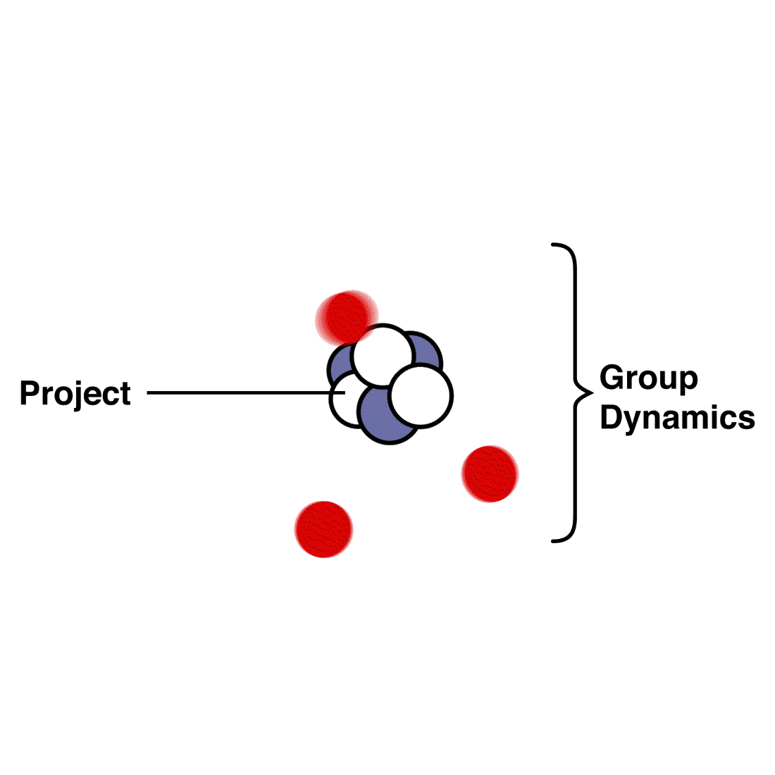
Motion Design / Class of 2019 - 2021 (1:26min)
Date: 2019
Field: Illustrations / Motion Design
School: Hyper Island / Karlskrona. Sweden
Program: Motion Designer / 2021 KNA
Course: 02 - The fundamental crafts and tools of motion design / 05 The 12 Principles of Animation with Kajsa Råsten
Instructor: Kajsa Råsten
..................................
A “bouncing ball” has to be the ultimate starting point for an animator as it entails most of the principles in one action. I wanted to expand on that exercise and in the course "fundamental of crafts and tools of motion design" at Hyper Island we had the first real opportunity to create our own animation from start to finish.
I wanted to create an animation that explored some of the early learning experiences in "the first 3 weeks" of Hyper Island. It turned into a sort of "meta video" that explained the structure of the classes at the school in Karlskrona, as well as the bonds and group dynamics that form between the students working on projects together.
Initially I thought of this animation as a way for me to interpret and explain, in my own words, some of the core approaches to work. Something which Hyper has developed and honed through the years. I saw this as a method for me to grasp the theories (the soft skills), as a useful way to learn the "hard tools" (the programs), and in so doing "kill two birds with one stone." It would also be a fun way to memorize the names of my classmates.
I found it fitting to do our class list as a periodic table, as we all have our own different personalities and attributes. In projects we would be working on creating new stuff together, compiling and forming new elements. I noted down and wrote scripts for some of the main lessons and figured I might do a series of them. They were meant to have an old school explainer video feel to them.
This animation was the first one in that series and coincidentally my first "real" animation.
..................................
How to become swedish in 60 minutes
Date: 2016
Field: illustraitions / screenplay
Collaborators: Jorri Kristjánsson / Bjarni Haukur Þórsson / Hermann Karlsson / Örn Árnason / Sigurður Sigurjónsson
Client: Thorsson Productions
..................................
The show is loosely based on the phenomenally successful “How to become Icelandic in 60 minutes” that’s been running for 5 years to sold out houses at The Harpa Concert Hall in Reykjavik, Iceland.
A one-man comedy show performed by entertainer, writer and producer Bjarni Haukur Thorsson. As the title suggests spectators are introduced to a blend of incisive and visual observation of the Swedish human condition as well as a lessons in everything you need to know about being Swedish.
The act includes a short video introduction to the history of Swedish society in which characters and events are illustrated.
..................................
Veðraland
Date: 2011
Field: Illustrations / graphic design / book
Collaborators: Jósep Gíslason
Client: Hrafnar ehf
..................................
Veðraland is a fantasy novel and children's book set in a time before men on the small island of Iceland. The race of dwarfs must make a journey to free themselves from the tyranny of trolls, elves and wizards. With cunningness by the leader of the pack they defeat their enemies by turning them against one another.
..................................
Iceland Tourism Cluster Map
Date: 2018
Field: Infographics / illustraitions / branding
Collaborators: Hrefna Lind Einarsdóttir
Client: Iceland Tourism Cluster
..................................
The Tourism Cluster Initiative is to promote competitiveness and value creation within the Icelandic tourism industry, and to develop a co-operating forum for different stakeholders where the main focus is on linking them together and opening up for interaction between them.
The members of Iceland Tourism Cluster Initiative are 45 from all over the value chain of Tourism. The cluster network consists of travel agents, tour operators, hotels, attractions and activities, restaurants, airlines, public relations, IT solutions, maintenance service, engineer service, banks, foreign exchange, law firms, educational institutions and retail.
The Icelandic Tourism Cluster needed an interesting, lively image to decorate its main office in the center of Reykjavík. We decided to do a chalk art piece which would designate over a hundred specific locations around Iceland. These places famous for their beauty and their unique aspects are what makes Iceland one of the most interesting places to visit.
Iceland is full of exciting activities and breathtaking landscapes and cultural attractions. You can witness geysers, waterfalls, glaciers, volcanoes, valleys and endless stretches of black sandy beaches. For activities, you can go hiking, biking, snowmobiling, kayaking or just soak up the warmth of a natural hot spring.
..................................
Tech Action
Date: 2019
Field: branding / logo
School: Hyper Island / Karlskrona. Sweden
Program: Motion Designer / 2021 KNA
Course: 03 - Exploring and experimenting with the tech of Motion design
Instructors: Annie Tådne, Dano Marr
Client: Tech Action
Collaborators: Redyy Nej, Philip Månsson, Teodor Mets, Mathias Bilevits, Nahom Zerai, Gladys Deborah Mbuyi, Anton Björn Niklasson, Lena Klimova, Lisa Lennartsson, Angie Hasa, Frans Sjöberg, Mikael Alborn & Anton Thulin
..................................
For the course "Exploring and experimenting with the tech of Motion design" we were tasked to create an event to showcase creative projects that dealt with the United Nations Sustainable Development Goals.
The project had the title "Tech Action'' and on 12th December 2019 we held an exhibition in downtown Karlskrona, Sveden. 14 groups from Hyper Islands showcased their projects that had the common theme of being technology-based and addressed and raised awareness to the United Nations Sustainable Development Goals.
I was tasked to create a logo for the event and other branding material.
..................................
Neighbourhood Development Plan – Árbær
Date: 2017
Field: illustration / maps
Collaborators: Ævar Harðarson, PhD arkitekt FAÍ
Client: Department of Environment and Planning / Umhverfis- og skipulagssvið Reykjavíkurborg
..................................
The department of Environment and Planning oversees all construction and maintenance projects carried out by the city. The department provides advice to residents, councillors, consultants, designers, contractors and others that need advice and information on planning and construction.
The neighborhood development plan is a new type of local plan made for the overgrown neighborhoods - i.e. a plan for a fixed settlement that covers a larger area than a traditional local plan. This new neighborhood plan will combine different neighborhood plans within the city into a single comprehensive plan that simplifies the creation and follow-up of each organization's policy, structure and vision.
In an effort to provide citizens and local residents with a comprehensive vision of the departments proposals the city council approached me to make a illustrated map for specific sections of a designated neighborhood. The locations are all chosen within the city district of Árbær (Árbær, Ártúnsholt and Selás) where the new neighborhood development plan is to be implimented. Located in eastern part of the city, the Árbær neighborhood is well known for its natural surroundings and pristine nature.
The map addresses most of the new schemes and specific designs in these locations. These ideas range from creating new market square, public vegetable gardens and new road applications to individual designs and construction solutions for private housing. Its kind of a “Where's Waldo” for residents to dive into the city's new development plan.
..................................
Þjónaskólinn
Date: 2018
Field: branding / logo
Collaborators: Hrefna Lind Einarsdóttir
Client: Margrét Rósa Einarsdóttir / Þjónaskólinn
..................................
Þjónaskólinn was established in Iceland in the winter of 2017. Their objective is to train and prepare individuals working in the service industry.
The company was founded by Margrét Rósa Einarsdóttir, a well known hostess and restaurant owner in Iceland with over 40 years experience in the field. After the tourism boom that has swept Iceland in the last 5 years Margrét felt that there might be an opportunity to expand and further the skills of the people employed in the cervice industry. The school has its mission to bolster, educate and broaden the abilities and knowledge of workers in the service industry.
..................................
Final Exhibition MD21
Date: 2020
Field: Illustrations / Motion Design / Marketing
School: Hyper Island / Karlskrona. Sweden
Program: Motion Designer / 2021 KNA
Course: 13 - Personal project - (Marketing)
..................................
Exhibition Identity
The “Personal Project” is the final course that students of the Motion Design program at Hyper Island take part in. The "Personal Project" gives the students a chance to exhibit their skills in Motion Design by creating a short animation of their own. It is optional for the students to work on the project by themselves or in collaboration with other students.
At the end of the course the students host an exhibition where industry leaders and other interested parties can join in the screening of the projects. Due to the COVID-19 pandemic it was decided to host the event online.
I offered to take part and lead the creative team behind the marketing of the "Final Exhibition" for the Motion Design Program at Hyper Island KNA. I created multiple teasers and trailers for the marketing, some of which can be seen here. This content was then shared on social media as well as in bought ads on instagram
Brand Experience & Characteristics
In line with the education that the students had taken part in, over the course of 16 months, we felt it was imperative that all of our marketing material would be done with motion properties. Invitations, advertisements (social media, google ads and other platforms) as well as trailers and exhibitions were made as gifs and in MPEG-4 formats. We suggested that all the material would be done in square format for easy use on social media and other online platforms.
The "Personal Project" is a collective exhibition by the students of the MD-21 program at Hyper Island. Therefore the design and aesthetics of the exhibition itself, the graphic profile, marketing and web page should try to be a neutral backdrop for all of the projects. We suggest the following:
ꞏ Typography is limited to classical and widely used typefaces such as Helvetica and/or Times New Roman. These typefaces are known for their neutral and/or expressionless characteristics.
ꞏ Kinetic typography instead of custom made icons with motion properties.
ꞏ An emphasis on black and white colors, with the additional usage of Hyper Island brand colors.
Titles, Slogans & Invitations
We started out by idating on the information that we wanted to express to the viewer. These were the titles, slogans and Invitations
The title for the "Final Exhibition" is meant to be displayed, moving around the border, framing the message of the marketing material. It is the unofficial logo of the event.
Final Exhibition - Motion Design - Hyper Island - November 27th 2020
The slogans are meant to function as the catchphrase/tagline to the event and can be thought of as a secondary icon for the event, suitable as stickers or short gifs.
WE ARE THE CLASS BC-AC Slogan 2. REAL WORLD READY- MORE THAN EVER
Invitations were done in collaboration with the event group as we concluded where the exhibition would be held at.
Welcome to the annual Final Exhibition in Motion Design at Hyper Island. Online on the 27th of October 2020
Graphical Profile
Format - Square 1:1
Invitations, marketing material such as advertisements (social media, google ads and other platforms) as well as trailers and exhibitions will be in gif and/or MPEG-4 formats. We suggest that material should be done in square format for easy use on social media and other online platforms. The reference for the square format also hints to Hiper Island's sticker motive found in the brand book.
Typography - Helvetica Neue
By utilizing two of the most recognized and widely used typefaces we get the aesthetic hint of neutrality in the graphical representation. These fonts can then be altered by the use of rasterization and distortions to give some appeal.
Kinetic typography
Kinetic typography, "moving text" is an animation technique mixing motion and text to express ideas using video animation.
The Exhibitions brand Identity is not meant to have a specific logo. The unofficial icon of the campaign is only the title of the Exhibition itself, executed kinetically around the border of the information being conveyed. The title moves counterclockwise around the center of whatever message is being conveyed. The title is meant to be the frame in which the message is being conveyed, just as the exhibition venue for which we showcase our work.
Additional text that appears within the frame is also meant to be done in a similar style as the title and can have kinetic movements.
Color
In keeping with the neutral motive of the Exhibitions brand Identity there is an overall emphasis on the use of black (#000000) and white (#FFFFFF) to form a visual representation of neutrality. Additionally the campaign adopts colors from Hyper Islands brand identity: Teal (#04C3A5), Orange (#FE3F00), Pink (#EC1A6D), Purple (#673D9F)
Brand Book
After the Exhibition Identity had been established and summarized in an pdf brand book, accessible in a shared google document, other teams used and incorporated our designs for a web page and online exhibition, live event page.
View all of the MD21 Projects on vimeo: MD21 Personal Projects
View our online, Exhibition event page: www.md21final.com
..................................
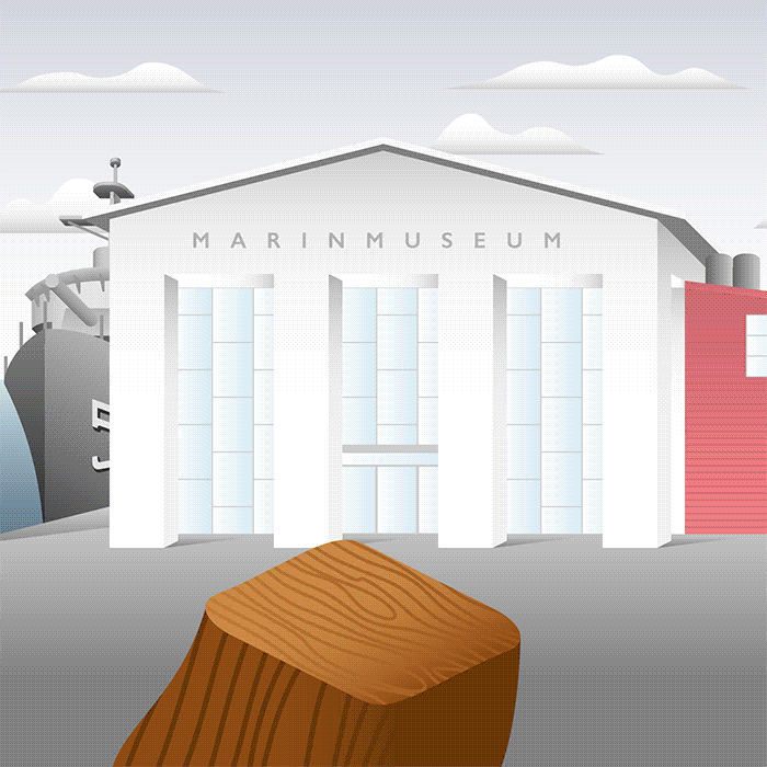
Marinmuseum (4:08min)
Date: 2020
Field: Illustrations / Motion Design / Production / Project Management / Concept Development / Character Design / Animation
School: Hyper Island / Karlskrona. Sweden
Program: Motion Designer / 2021 KNA
Course: 08 - The Motion Studio
Instructor: Deni Dimovski, Henrik Svilling & Romeo Vidner
Client: MARINMUSEUM
Contact: Malin Jogmark & Veronica Westerblom
Collaborators: Giancarlo Mitidieri, Julian Briland, Lena Klimova, Mathias Bilevits, Miguel Evangelista, Miriam Muelle & Nahom Zerai
..................................
Introduction
For the course "The Motion Studio" we were tasked to work with one of Sweden's oldest museums, the Marinmuseum, situated in the city of Karlskrona. Established in 1752, it functions as Sweden's national naval museum, dedicated to the Swedish naval defense and preservation of the country's naval history.
About Marinmuseum
In its exhibitions, the museum tells the story of the men and women who built and sailed the ships, and whose lives were affected by war and the threat of war. Through film, objects and personal stories they cover 500 years of naval history. To make this comprehensible to a younger audience they have special family and school programs in which they narrate the story from a perspective closer to children. This is where they need additional media in order to catch the children's attention.
Intention
The intention of the project was to create an introductory animation to the Marinmuseum, aimed for younger visitors and families. The animation would address and introduce the permanent ongoing exhibition at the museum, "500 years of Naval history".
The Goal
The goal of the project and the subsequent animation was meant to help the children to get a grasp of the history portrayed at the museum and the museum itself. The animation is meant to be an engaging experience that entertains, educates and raises their interests. It will help the children to understand the procedure and the conduct of the exhibition, as they time travel through different centuries. This is currently done with the use of a puppet character “the louse”, operated by curator guides at the museum.
Treatment Summary
So our task was to make a short animation that introduces the story of Louie the louse. A character that has accompanied humans (in and outside of the navy) for as long as we can trace human history.
TONE Fun / Adventure
THEME History of the Swedish navy and the people who lived it
PLOT A louse that invites the viewers to go along in a time travel through history. The louse travels in a submarine time-machine to different centuries meeting interesting people that they will learn more about in the exhibition itself.
Synopsis
A louse that introduces Marinmuseum and invites the viewers in a literal and metaphorical sense to “dive deep” into the history of the navy in a submarine time traveling machine. We travel to important moments of each century, meeting interesting people, their lives and events that shaped history.
Hi5 Studio
We wanted to approach the process as an official design studio / animation studio, so we created the studio Hi5. We have gotten a chance to experience and learn about the processesses, the production stages of other studios and lecturers, mainly AD-me and Deni at New Presence. We set up a shared gmail account, where we would communicate with clients and host the assets and creations of the studio. On drive we created and organised folders with names for each step of the production we were going through.We made a budget and a schedule in google sheets (excell). There we set up the pipeline / production stages. We noted down our estimated hours and real hours as well as estimations for every category. This is also where and how we kept track of individual workload in the project. This also functioned as a schedule.
..................................
Loft Hostel
Date: 2013
Field: Illustrations / Installations
Collaborators: Hrefna Lind Einarsdóttir / Baldur Helgi Snorrason
Client: Loft hostel - Hostelling International
..................................
Loft Hostel opened its doors in the center of downtown Reykjavík in spring 2013. Located on Reykjavík’s city center and they host regular music events, movie nights, foosball tournaments and other social events.
The mural paintings are a collection of the most iconic buildings in Reykjavík as well as functioning as a floor guide.
..................................
greaseandglamour.com/2014/04/why-the-loft-hostel-in-iceland-isnt-any-old-hostel/
www.lofthostel.is
Fébætur
Date: 2017
Field: branding / logo
Client: Fébætur / Guðbrandur Jóhannesson lögmaður hdl
..................................
Pétur Stefánsson. Fébætur is a law Firm that specializes in insurance, injury and accident insurance. Founded in 2017 it has a number of accomplished agents with a long standing experience and an excellent record in the field. A detriment, professional and trustworthy firm which the logo tries to emulate, embodied with the ram.
..................................
Architectura
Date: 2010
Field: Illustration / Poster / Font
..................................
An inspiration of one of Spiro Kostof´s quotes:
“Architecture is a social act and the material theater of human activity.”
Each letter is designed as a building, meant to represent or indicate one of the basic functioning institution and public services in modern western society.
..................................
Stúdentaráð Háskóla Íslands
Date: 2012
Field: Branding / logo
Collaborators: Davíð Ingi Magnússon
Client: Stúdentaráð Háskóla Íslands (SHÍ)
..................................
The Students' Council was established in 1920 and has fought for the interests of students and various improvements in the university community. It is the advocate of all university students and handles cases regarding student interests in relation to university authorities, the government and others that influence the policies of the university. It publishes the Student Paper an ambitious medium for news, entertainment and information, and is distributed to all students at the University of Iceland.
..................................
www.student.is
Hekla
Date: 2016 -
Field: Illustrations / Installation
Collaborators: Örn Smári Gíslason / Hrefna Lind Einarsdóttir
..................................
The car dealerships Hekla is one of the oldest, largest and well respected companies in iceland. Established in 1933 it has held agency for the biggest car brands such as Volkswagen, Audi, Skoda, Mitsubishi, Caterpillar, Goodyear, General Electric and KIA. In 2016 Hekla made renovations to its large headquarters at Laugavegur and added a magnificent cafeteria on the top floor. It was made to service all of their employees and to be used for social events. To mark this location and its long and fruitful history in Iceland they wanted an illustration to emphasize milestones in its history. The cafeteria was named, the appropriately dual meaning in Icelandic “Hekla eldstöð” (Hekla the cooking station/ Hekla the volcano) because Hekla is also one of the biggest and most famous volcanoes in Iceland. In cooperation with designer Örn Smári Gíslason i make an illustration with chalk on the walls of the cafeteria.
..................................
San Francisco Illustrated Map
Date: 2011 -
Field: Illustrations
Collaborators: Snorri Þór Tryggvason / Tryggvi Árnason / Eric Meltzer / Shan Wang
Client: The Open Company (US)
..................................
The TOC guide to San Francisco is a hand-drawn and water colored map which highlight the 38 best restaurants in San Francisco as well as 20 landmarks in the city. The map and locations where made using 3D models and aerial photographs to ensure accuracy.
The map is printed on waterproof tear-resistant Tyvek. It's then folded up using an origami technique that allows it to smoothly open and close in one motion, and makes it impossible to misfold.
The project was an international effort in that the clients as well as other collaborators live and work around the world. The map is printed by Yushin-Plus, an art printing company in Tokyo, folded by the Miura-Ori Lab, also in Tokyo and Aen Tan (Singapore) did the typography and layout.
..................................
theopencompany.net
Studyhax (20sec)
Date: 2020
Field: Illustrations / Motion Design / Production / Project Management / Concept Development
Client: Studyhax
Contact: Davíð Ingi Magnússon
Collaborators: Hrefna Lind
Music: Marína Ósk & Mikael Máni
..................................
About Studyhax
Studyhax is an online learning platform and production studio that specializes in the field of education. Founded in Reykjavík Iceland the company has specialized itself in the production and distribution of learning videos online. In recent years and not least with the advent of the COVID-19 pandemic the company has enjoyed an increasing popularity among students that want to reinforce their learning process. The company has grown rapidly and gained a leading position in the field of online education in Iceland.
Studyhax motto: "Live, learn, upgrade".
Studyhax produces and hosts learning courses in varied subjects such as math, psychology, natural sciences and physics, to name a few. Their goal is to prepare students' knowledge in their learning journey through the educational system on all school levels. They do this by sharing the knowledge of exemplary students, so-called "instructors", in high-quality short videos, produced with first-rate recording and sound equipment. Consumers are invited to enjoy the instructional videos in subscription service by logging in to the company's website.
By utilizing the different strengths of individuals from different backgrounds, the company achieves its goal of producing high quality teaching materials, which is useful to students at all school levels. The company works on the ideology that 20% of the work returns 80% of the results. Therefore the company focuses on teaching the core aspects of the material, the most important things that students need to know about the subjects. The company's target group is people of all ages who study various disciplines.
Film premise
The project consisted of making a concept, designing, drawing and producing a short "intro" for the company's multitude of instructional videos. They are meant to give users as well as potential users the impression of a high quality production and an enjoyable learning experience.
The video hints to the journey that students take to educate themselves and to ultimately become productive members of society. In other words, by taking part in the education that Studyhax films in their studio and provides in online courses, they will be better equipped to pursue and take leading positions in society and in life.
The intro video is meant to show the process and the work that goes on behind the scenes and to be a pleasant experience in each viewing.
Video Description
The intro starts off with a beautiful morning and the path of higher learning winding through the landscape. In the landscape you can spot all of Iceland's administrative Universities buildings as well as the parliament of Iceland, the "Alþingi'', the iconic Hallgrímskirkja and office towers. You can also spot “Mímisbrunnur” in the center of the frame which is the fountain of wisdom in Nordic mythology. As legend has it, the one who drinks water from the well becomes enriched with knowledge.
After this scene we are taken into the Studyhax recording studio where we watch as the studio gets installed with all the equipment needed for another session with our "instructors".
Finally, we see the students' laptop opening up and the studyhax logo appears.
..................................
Gallerí grandi
Date: 2011
Field: Branding / logo
Client: Jóhannes Sturlaugsson / Gallerí Grandi
..................................
The art gallery, Gallerí grandi offered works from numerous Icelandic artists, jewelry, ceramic, paintings, sculptures, glass art and textile directly inspired by Icelandic nature. Situated in Grandagarður, a row of building complexes at Grandi, the facility was originally built for seamen who operated in the Reykjavík old harbour. It has in recent years been redesigned for commercial use and the whole of the Grandi area has largely been taken over by artists, musicians and innovative computer companies. Happily some of the charming shops who served the local fishing workers and businesses still thrive in the area.
The obvious choice was to adopt the distinct architecture of the Grandagarður housing and use the facade as the focal point of the logo.
..................................
www.gallerigrandi.is
The Official Illustrated Guide Map of Hafnarfjörður
Date: 2014 -
Field: Illustration / graphic design / layout design
Collaborators: Snorri Þór Tryggvason / Brian Suda
Client: Hafnarfjörður municipality
..................................
Hafnarfjörður is Iceland's third largest town, with a population of over 26,000. The Official Illustrated Guide Map of Hafnarfjörður is an hand-drawn, water colored map of the center of Hafnarfjörður.
The map is made up of about 90, A-3 water colored drawings and was made using a 3D model of the down town area and aerial photographs to ensure accuracy. It has an isometric view to the east.
The map has been praised for its usability and attention to details. Copies of the map are free and can be found all around the capital area.
..................................
4 Dragons
Date: 2019
Field: branding / logo
Logo by: Hrefna Lind
Client: 4 Dragons
Collaborators: Hrefna Lind
..................................
Logo design done for Four Dragons, company that will deliver quality frozen fish from Iceland. The name is inspired by the story of the four dragons from chinese folklore, and the logo is combined by these 4 dragons ( 4 main rivers in china ), Iceland and sea waves.
..................................
IÐAN / CMYK
Date: 2017
Field: branding / logo
Collaborators: Hrefna Lind Einarsdóttir
Client: Kontor Reykjavík – Auglýsingastofa / IÐAN Education Centre
..................................
IÐAN is a private non profit education and training provider supported by the federation of employees and unions represented by the industries we serve nationwide.
IÐAN offers a wide range of services for its members spanning from courses, counseling and validation of prior learning. We also provide various services for the ministry of education, science and culture and are involved in creating both national and international partnerships in order to embrace innovation and meet new challenges in support of our industry.
To promote new courses at Iðan the educational centre wanted to find a suitable and interesting way to introduce the courses to printers and designers. In cooperation with Kontor Reykjavík – Auglýsingastofa we designed a direct mail that would show the possibilities design and printing offers. We created a printed material where we paid careful attention to detail and the outcome was a beautiful item that was all at once an illustration, a game, practical and an advertisement. The process, from idea to completion of the item, was filmed in order to make a video that could be shared even further.
..................................
Örk Bygg
Date: 2018
Field: branding / logo
Client: Ásgeir Arnór Stefánsson / Örk Bygg
..................................
Örk Bygg is an ambitius building contractor which started opirations in the summer of 2009. The company employs a large capacity of experienced employees as well as educated technicians. Örk Bygg is a company known for it´s reliability, fast-track construction time through construction and post construction.
..................................
Green Marine Technology
Date: 2014
Field: Illustration
Collaborators: Björgvin Óli Friðgeirsson / Darri Úlfsson / Snorri Þór Tryggvason
Client: Íslenski Sjávarklasinn (The Iceland Ocean Cluster)
..................................
Green technology refers to technology which improves production processes, productivity and efficiency, use of raw materials or energy and reduces waste as, waste and pollution.
The green marine Technology is a project funded and run by The Icelandic Ocean Cluster and is meant to answer the call for environmentally friendly technologies in the fishing industry as well as in in other areas.
The interactive online map which was made for the project is meant to highlight and educate the public and businesses of the newly invented technology made, used and operated by the Icelandic fishing industry and their clients around the world. The map itself is a fictional representation of an model fishing village that utilizes this new technology.
..................................
Iceland Illustrated map
Date: 2012 -
Field: Illustration / marketing / sales
Collaborators: Snorri Þór Tryggvason / Brian Suda / Björgvin Óli Friðgeirsson / Ómar Ragnarsson *****
..................................
This hand-drawn terrain map of Iceland was made with the use of a 3D model of the whole of the island to ensure accuracy. To amplify the beautiful characteristics of the mountains, glaciers, volcanoes, forests, lakes and rivers of the land we had the use of some great aerial photographs and the advice from the television reporter and pilot extraordinaire Ómar Ragnarsson and his lifelong experience and knowledge of the terrain.
The map has been printed in 75.000 copies each year since its first publication and is distributed for free all around the country. The Reykjavík municipality agency Visit Reykjavík (Höfuðborgarstofa) and promote Iceland (Íslandsstofa) have used the map in promotions for the country.
..................................
www.icelandillustrated.com
Borgarleikhúsið
Date: 2016 -
Field: Illustration/ Installation
Collaborators: Hrefna Lind Einarsdóttir
..................................
The Reykjavik City Theatre ranks among Iceland’s oldest and most prestigious cultural institutions. The theatre’s history reaches back across a century. Alongside the National Theatre of Iceland it is one of the two eminent dramatic stages in the nation. Reykjavik City Theatre, as the name suggests, is the municipal theatre of Iceland’s capital city. For their annual promotional material they wanted to emphasize the lively and exciting world of the theater and its productions. The perception felt for the theater, its employees and the vast new building, comparable to Europe’s best resorts was akin to a living, breathing organism. With this in mind we made a semi realistic section cut/view of the core functions and facilities of the building. A sort of Where's Waldo drawing where almost every employe is represented and their role within the day-to-day operations in the theatre presented. The large image was printed and is showcased in the lobby of the theatre where it has become something of an attraction, especially for the younger generations.
..................................
Pisa - Restaurant & Guesthouse
Date: 2010
Field: Illustration / Posters
Client: Pisa - Restaurant & Guesthouse
Vættir / Spirits - HönnunarMars 2016
Date: 2016
Field: Illustrations / Installation
..................................
DesignMarch is a celebration of the fresh and exciting Icelandic design scene. The Festival showcases the best from the local design scene, alongside an increasing number of international collaborations. The scope of the Festival covers all fields of design, be it graphics or fashion, furniture, architecture or products. All in all, there are over 100 events, exhibitions, workshops, seminars and parties. Spread across Reykjavik, DesignMarch attracts around 30,000 visitors annually. For the 2016 festival i created an illustration on the theme of vættir.
Vættir (wights or spirits) are nature spirits in Norse mythology. These nature spirits are divided up into 'families', including the Álfar (elves), Dvergar (dwarves), Jötnar (giants), and even gods, the Æsir and Vanir. I wanted to commemorate these beings and my grandmother's relationship with them with an dual image. The illustration could be viewed as a simple image of my grandmother in the countryside where she grew up but by putting up a red filtered glass to the image, you could see all the vættir surrounding her.
..................................
Lögmenn Kirkjutorgi
Date: 2016
Field: Branding / logo
Collaborators: Hrefna Lind Einarsdóttir, Jónas Örn Jónasson
Client: Lögmenn Kirkjutorgi
..................................
Lögmenn Kirkjutorgi is a new and small law firm situated in the downtown area of Reykjavík.
The goal of the branding and logo was to make something a little bit more exciting and fresh. This was to emphasize the spirit of the firm, its employees and their attitude in business, while also giving it a stark contrast to other firms logos in the field. Fresh colors wear essential as well as a stable yet original design.
..................................
Alvogen
Date: 2016
Field: Illustrations
Collaborators: Hrefna Lind Einarsdóttir
Client: Alvogen
..................................
The international pharmaceutical company Alvogen has for many years participated in the established pharmaceutical event CPhI. The aim of the conference is to unite niche and top buyers and sellers in the pharmaceutical industry together under one roof in nine event locations around the world.
For the event hosted in Barcelona in the summer of 2016, Alvogen wanted to reimagine they're exhibition pavilion. In cooperation with the architecture firm Tvíhorf they imagined a comfortable, exiting and open pavilion with a focus on refined and sustainable materials.
Capitalising on the success of the icelandic soccer team in the 2016 UEFA European Championship and the strong soccer culture in the city of Barcelona, Alvogen wanted to make a play area in the front section of they're pavilion. Guests where invited to take part in a soccer game with prizes. To emphasize this atmosphere i created an illustration which references the soccer stadium of Camp Nou and some of the most iconic buildings and architecture of the city of Barcelona. The illustration was not complete without the three most notable soccer players in the Barcelona team, Lionel Messi, Neymar and Luis Suarez.
..................................